Study Befikar
Redesigning a study abroad consultation platform for clarity, hierarchy, and usability
Role
Product Designer
Industry
Education
Duration
3 months

OVERVIEW
Befikar is a study abroad consultation platform helping students navigate the process of studying overseas. The platform existed but the website wasn't doing its job, it looked like a graphic design project, not a product. Information hierarchy was broken, navigation was cluttered, and the brand had a defined color system that was barely used.
My job was to fix the layout, not reinvent the brand. Copy, colors, and core branding were preserved. Everything structural was redesigned.
PROBLEM
The original site had four compounding issues:
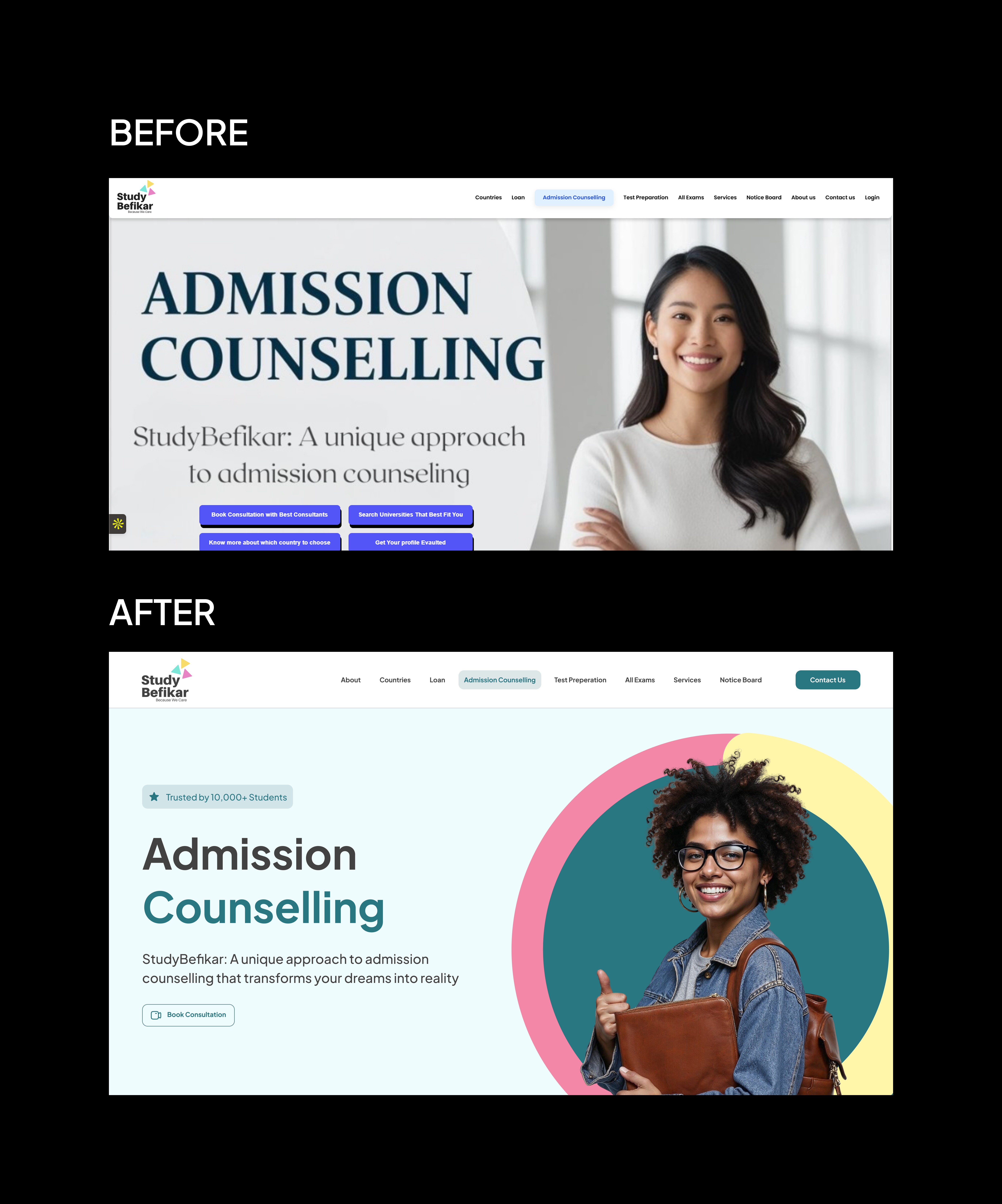
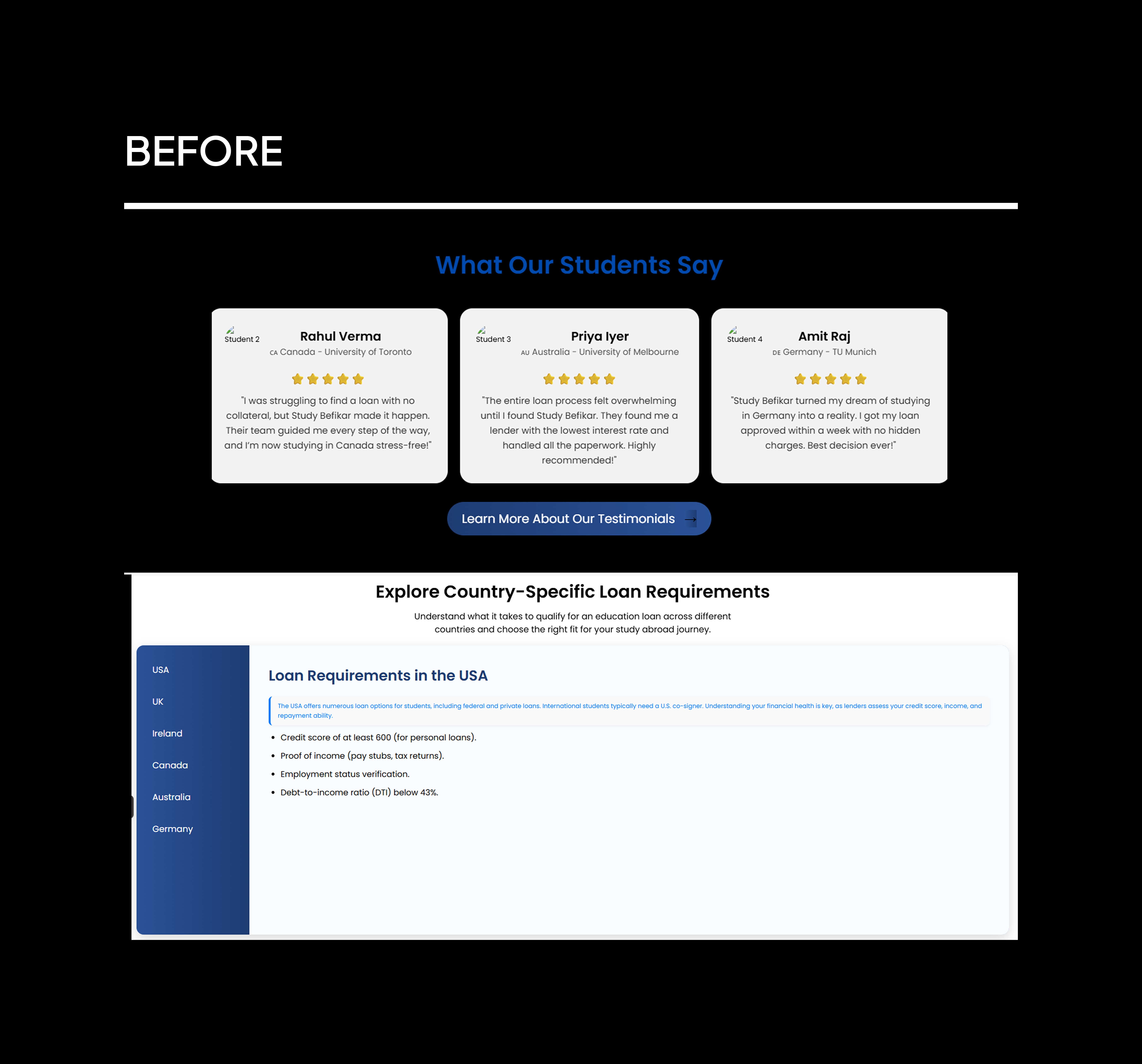
Broken visual hierarchy: Content was laid out without clear priority. Nothing guided the eye. Sections ran into each other with no breathing room, making the page feel dense and unstructured.
Navigation overload: The navbar had too many top-level pages with no grouping logic. Users had no clear path through the site.
Brand inconsistency: Befikar had a defined brand color but it was barely applied. The site felt generic despite having a visual identity to work with.
Vague copy with no context: Some content used terminology, financial, process-related, without explanation. For students unfamiliar with study abroad processes, this created confusion at critical decision points.
An additional constraint surfaced during execution: some sections had far too much content to display cleanly. This wasn't a layout problem, it was a content problem that required direct client involvement to resolve.

SOLUTION
1. Layout and spacing system
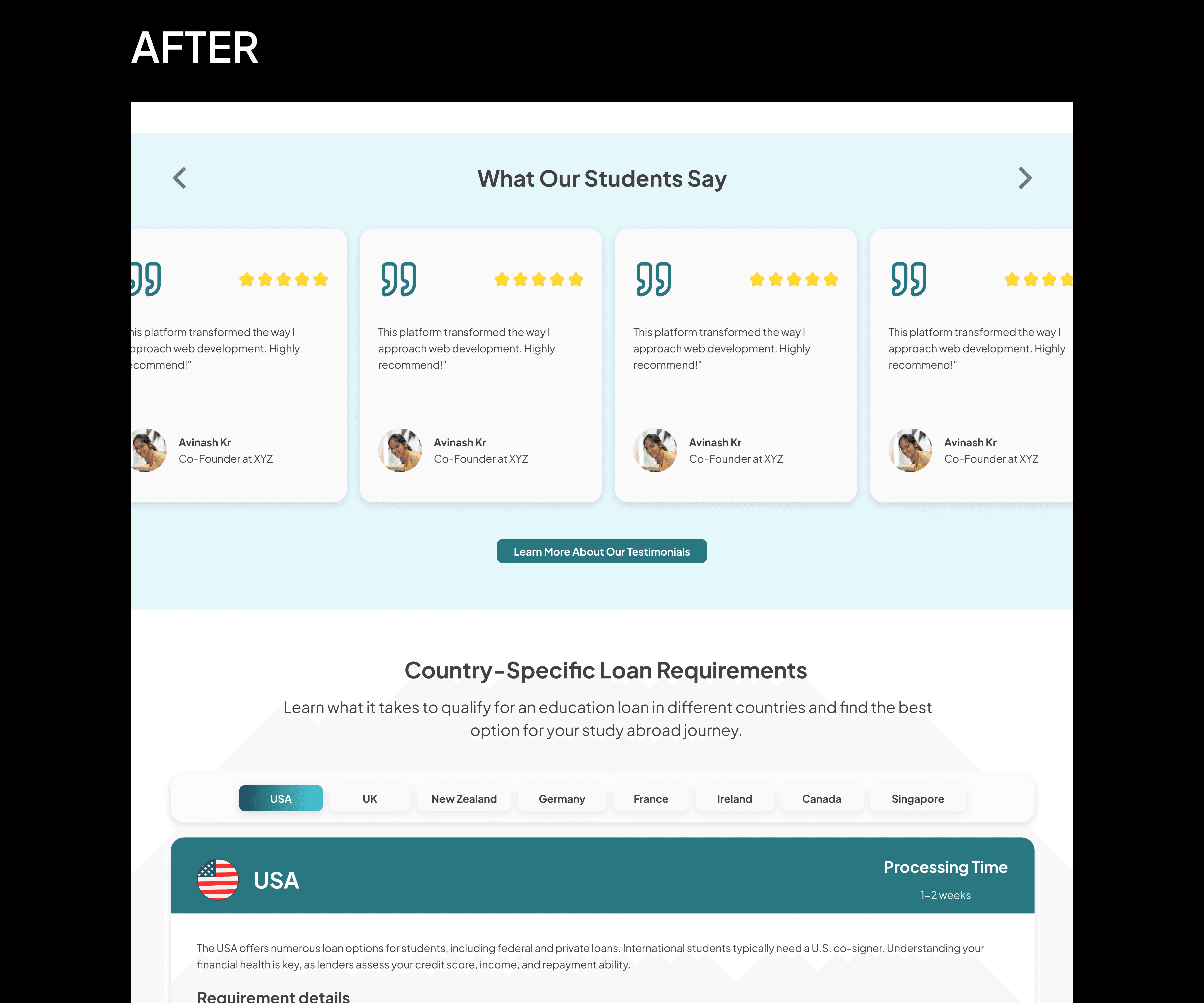
The most immediate fix was introducing consistent spacing between sections. The original had none, sections were visually fused, which made the page feel overwhelming and hard to scan.
I established a clear sectioning system so each content block had room to breathe and a distinct visual boundary.
2. Information hierarchy
Content was reorganized around what a prospective student needs to understand first, second, and third. Visual weight, typography scale, contrast, spacing, was used to signal priority instead of treating everything as equally important.
3. Navigation simplification
The original navbar had too many top-level items with no logical grouping. I compressed related pages into grouped dropdowns triggered on hover, reducing top-level clutter while keeping all content accessible.
This made the navigation scannable without removing anything the client needed to keep.
4. Brand color application
The brand color existed but wasn't doing any work. I applied it systematically, CTAs, section accents, key UI elements, to create visual consistency and make the site feel intentionally designed rather than assembled.
5. Content reduction
Several sections had far more copy than any user would read. I flagged these, made the case to the client that dense unread content hurts conversion more than it helps, and worked with them to cut the excess.
Not all cuts were accepted, but the negotiation reduced the worst offenders significantly.


HOW I APPROACHED IT
The constraint here was different from a blank-slate project. I wasn't defining a product, I was diagnosing one and fixing specific structural failures while working within a defined brand.
The process had three phases:
Audit: I mapped every broken pattern in the original: spacing failures, hierarchy problems, navigation logic, brand inconsistencies, copy issues. This gave the redesign a specific target list rather than a vague brief to "make it better."
Negotiation: Two issues required client involvement before design could fix them. The first was content volume, some sections were simply too dense to lay out cleanly regardless of design decisions. The second was image quality, some original images were too blurred to use, requiring me to source the originals. Both required direct conversations rather than design workarounds.
Execution handoff: This is where the project fell short of the designed outcome. Despite detailed briefs and calls with the development team, the final build lost key decisions, spacing, typography, animations, and layout scaling. The live site reflects approximate intent, not the designed system.

OUTCOME
The redesign addressed every structural failure in the original:
Clear section hierarchy with consistent spacing throughout
Simplified navigation with grouped dropdowns replacing a cluttered navbar
Brand color applied systematically across the interface
Contextual tags added to reduce terminology confusion for prospective students
Content reduced in the heaviest sections after client negotiation
The live site is not a full reflection of the designed output. Developer execution gaps, primarily spacing, typography, and layout scaling, meant the build diverged from the design. The case study visuals show the designed version, not the live site.


KEY TAKEAWAY
Three things stood out on this project:
Redesign constraints are design constraints. Working within an existing brand, copy, and client expectations isn't limiting — it's a different kind of problem. The creativity is in fixing structure without touching identity.
Content is a design problem. The densest sections couldn't be fixed with layout alone. Getting the client to cut copy was as important as any visual decision.
Design and development are two different outputs. The gap between the designed system and the live build was real. Next time: earlier, more specific developer alignment — not at handoff, but during design.
Other projects

Cleaques Bookings
A marketplace for trip planning and instant service booking across verified vendors, supported by a structured admin system.

Cleaques Sports
A digital platform connecting street football players, clubs, scouts, and fans through competitions, player discovery, live streaming, and creator monetization.

Talentrah
Expanding an AI-powered job platform into a dual-role hiring marketplace.